CONTEXT
ROLE
RESPONSIBILITIES
CHALLENGE
SOLUTION
PROJECT GOALS

Create an identity
Develop a design system that encapsulates the identity of the department and all of its teams

Showcase value
Understand and shift the perception of the design system to increase adoption into workflow
OUR APPROACH

To better understand the requirements for components and the feasibility of customisation, the team and I held multiple sessions with internal value streams to identify any overlaps between the required components for different teams and platforms.
WHY DID WE DO THIS
By collaborating closely with both developers and design system users, we fostered an iterative process with regular feedback exchange, ensuring alignment at every stage. Throughout development sprints, we supported developers by addressing challenges as they emerged and flagged any inconsistencies between the developed components and the original designs.
Through feedback sessions with users, we reviewed components post-development, comparing them to Figma designs and identifying any quality issues. This close collaboration allowed us to refine the design system continuously, maintaining quality standards and improving usability.

As the design system expanded to support diverse teams and platforms, we aimed to champion its adoption by integrating the toolkit into each team’s workflow. Our goal was to make the design system an essential resource, streamlining processes and enhancing consistency across the entire government organisation.
WHY DID WE DO THIS
Our goal was to drive adoption and reshape perceptions of the design system. We recognised a gap in understanding how to effectively integrate it into existing workflows, so we focused on providing guidance and support to help new teams adopt the design system seamlessly. A design system advocate would help new teams gain a clear understanding of its context and benefits.
MY ROLE
BRANDING
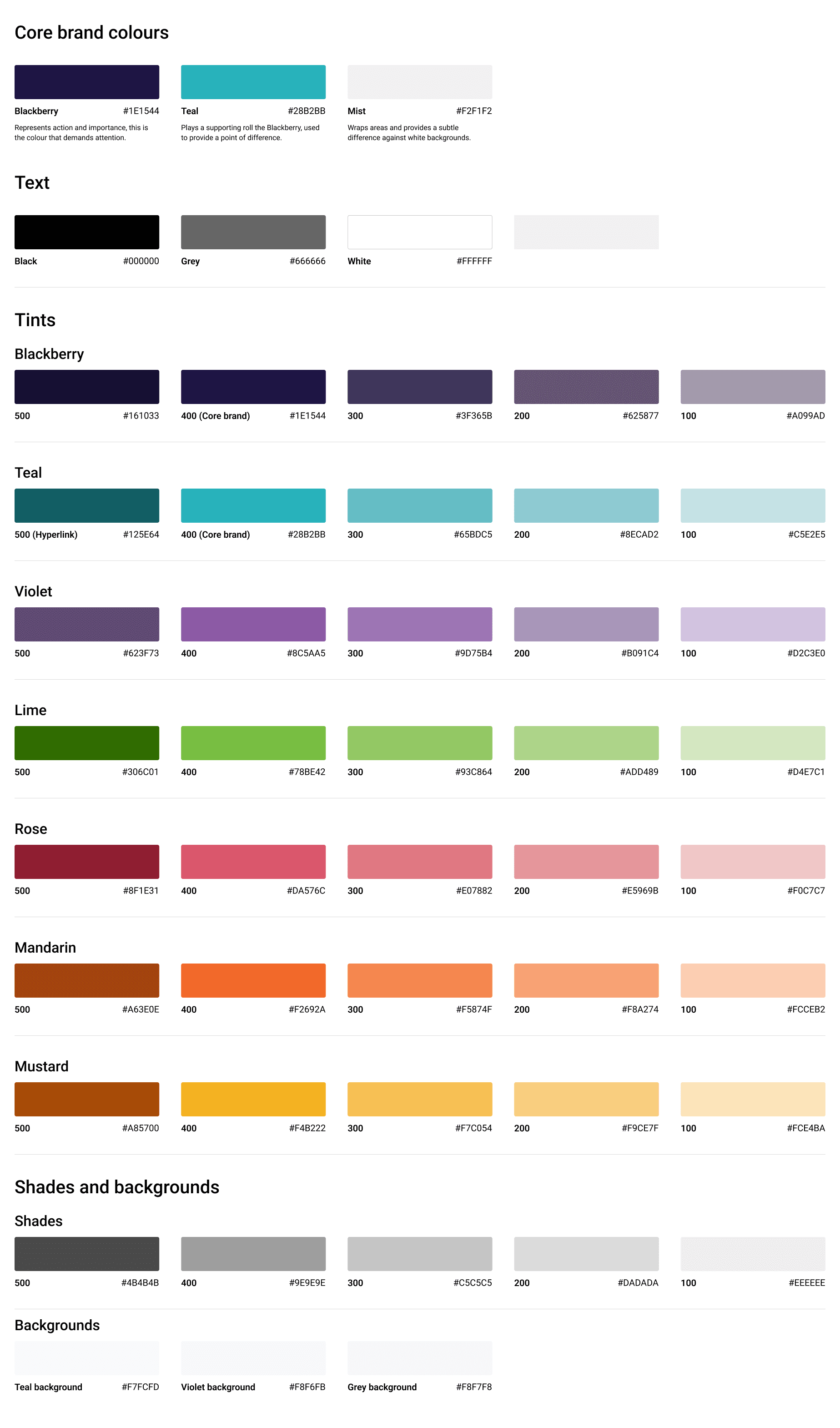
To kickstart the design process, I reviewed the work of the previous designer to gain a clearer understand of where to start. The department's branding already had established colours and typography.
IMPACT
By understanding the existing visual foundation and focusing on scaling the design system, our understanding of the department's branding has allowed us to create a consistent using experience and visual identity.
COMPONENTS
With a clearer understanding of the department's branding, we began designing common atomic components tailored with the ability to be integrated across current and future platforms. During this process, we had constant discussions with the value streams and developers about the components' behaviours, states, customisation, and implementation to identify similarities for a Core design file.
IMPACT
The reusable atomic components enabled us to efficiently build design libraries for new platforms, making only minor adjustments to meet the specific needs of different teams. Involving developers and value steam users into the team, and our processes, allowed us to quickly identify and resolve issues, significantly streamlining the process of developing and deploying components.
DEVELOPMENT
After completing the design of individual components, our developers began the process of translating each design into functional, reusable components. The components were then deployed into a sandbox environment, where I would be able to test and review the properties, states, and sizing in alignment with the Figma design specifications.
Throughout the reviews, any issues or discrepancies were documented. I took charge of identifying and addressing potential issues by creating detailed user story tickets in Azure DevOps. These tickets outlined the issue, the expected behavior, and any relevant context or design intent, which helped streamline the development workflow.
IMPACT
By using a sandbox environment and Azure DevOps for documentation, it enabled clear communication between design and development teams, ensuring quick iterations, and maintaining the overall design integrity across the system. It was a necessary process to ensure enhancements, bug fixes, and new components were released on time.
REVIEW
As mentioned in the previous process: after development, a review of the components were conducted from the sandbox by the design system team and any issues were documented within Azure DevOps. We also opened communication channels with the value streams to gather their feedback on the components, patterns, and templates. If users identified issues with deployed components, then designers will review the component and outline the issue within Azure DevOps.
Value stream user
Designer
Developer
IMPACT
Teams provided documents outlining the identified issues that allowed us to capture a comprehensive view of the issues they encountered. It was then transformed into actionable user stories in Azure DevOps. The structured approach enabled developers to quickly address and resolve issues, reducing response time and improving the quality of our updates. By streamlining the process from users to designers and finally to developers, we created an efficient feedback loop that kept the design system in tune with user needs.
Outcome
985 department employees have been onboarded into Figma and started using our design system.
4+ platforms
The design system has been scaled to cater for 4 platforms (Salesforce, .Net, Mobile Apps, & ServiceNow) - with the intention to continuosly grow for new teams.
6+ solutions
More than 6 digital solutions have been created and implemented using the design system as a visualisation tool.